Krishakher Haat –Digital Farmer’s Market
Product Strategy
UX Design
Interaction Design
Duration
2 Months
Role
MVP SaaS platform
Team
MVP SaaS platform

Outcome
Teachly is an MVP SaaS platform designed to help individual course creators manage their online classes, students and earnings more efficiently. The redesigned structure provided clarity across complex workflows, smoother navigation and simplified user interactions.
Through research, usability testing and multiple design iterations, the platform achieved:
Key Outcomes
Improved task flow efficiency across the entire course creation and live class management journey
Reduced cognitive load through a cleaner, structured interface
Clear differentiation of user roles and use cases
Higher usability confirmed through two rounds of user testing
A stable design system that supports scalability for future features
Overview
Teachly was created for individual course creators who run live classes online. Many creators struggle with managing students, creating courses, handling tasks, tracking performance and maintaining smooth communication in a single place. Existing tools were complex, difficult to navigate and lacked clear guidance.
The goal of this project was to design a platform that simplifies course operations from start to finish. This includes course creation, scheduling, student assignment, feedback loops, performance monitoring, session tracking and earnings management.
The design needed to be intuitive enough for new creators yet powerful for experienced educators.
Reduction in Cart Abandonment
Reduction in Cart Abandonment
Reduction in Cart Abandonment


Challenge
During initial research, several major pain points were uncovered:
Existing platforms were too complex for new course creators
Navigation felt overwhelming with too many nested actions and unclear structure
Course creation required too many steps without clear guidance
Tracking student performance lacked transparency and easy monitoring
Managing earnings, payment tracking and revenue insights felt scattered
Lack of mentor or sub mentor capabilities created gaps in workflow
Layout inconsistencies across modules created confusion
Users needed both live class and recorded class support
These challenges shaped the foundation of the redesign, focusing on clarity, segmentation and guided workflows.
Process
We followed a user-centered design approach with multiple iterations and testing phases to ensure the final solution met both business goals and user needs.
Research and Interviews
Mapped the flow from kiosk to shelf to mixing machine.
User Flows and Structure
Created a clear journey with simple, clear steps.
Interface and Interaction Design
Created modular UI and micro-interactions.
Testing & Iteration
Usability tests informed refinements.


Solution
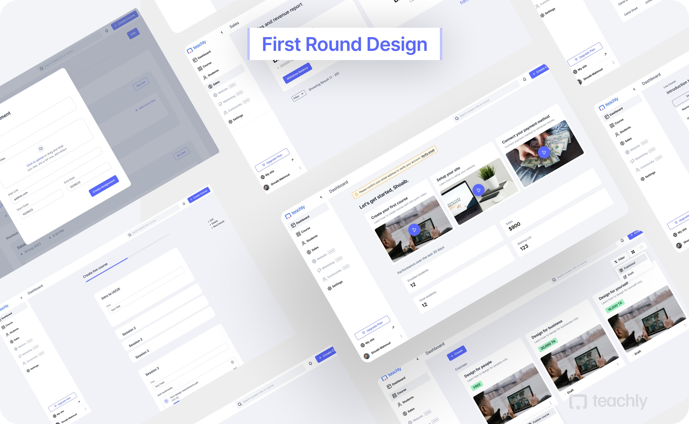
The final Teachly MVP delivered a structured and intuitive platform tailored for individual instructors.
Guided Course Creation
Step by step structure for building live classes
Clear visibility of sessions, outlines and materials
Preview mode to understand student experience
Instructor Dashboard
Clean overview of upcoming tasks, earnings and notifications
Quick access to classes, assignments and student performance
Student Management
Centralised student list with tracking
Attendance, task status and performance insights
Easy assignment feedback features
Earnings Module
Clear overview of revenue, instalments and due payments
Breakdown of income across students and courses
Financial transparency for creators
Scalable Design System
Modular components
Consistent spacing, typography and grid
Ready for new features like scheduling, marketing and recorded sessions
What Comes Next
Possible future extensions identified during user testing include:
Editable creator websites
Instalment payment expansion
Community features
Marketing tools
Multiple administrator support
Recorded course support
One to one sessions
Additional creator user types
Design Principles
Bangla-first and culturally familiar UI
High contrast for readability
Large touch targets for ease of use
Minimal cognitive load
Clear call-to-actions
The new design system established consistency across all pages while maintaining flexibility for future growth and feature additions.