What SaaS Founders Get Wrong About MVP Design (And How to Fix It)

Published:

Reading time:

13 min read
Category:
Strategy
Illustrated figure holding an oversized laptop displaying ‘Best Practice to Build Your Business’ on a yellow background

Research into recent startup failures consistently finds that the largest single cause is building products nobody wanted. Not bad code or poor execution, but never validating whether the problem was real and urgent enough for people to pay to solve. Analyses of SaaS startup post-mortems put product-market-fit failure at roughly a third of all startup deaths.

Building a full product without testing is expensive and fails most of the time. Building an MVP first cuts that cost substantially and gives you the data to course-correct before the runway runs out. The maths is obvious. And yet the most common SaaS MVP design mistakes are not about budget, they are about what founders believe an MVP actually is, and what they think design is for at this stage.

This post covers eight specific mistakes drawn from founder research, product development practice, and the consistent patterns Morphic sees across SaaS products that arrive after their first version did not produce the activation data they needed. For each mistake: what it looks like, why it happens, and the specific design fix. The research methods that prevent most of these are covered in the guide to user research methods.

The Misunderstanding Underneath Every MVP Design Mistake

Eric Ries defined the MVP as the version of a new product that allows a team to collect the maximum amount of validated learning about customers with the least effort. The key word is validated. The MVP's job is not to deliver a partial experience of the eventual vision. Its job is to test whether the core assumption behind the business holds up when real users encounter it.

When founders design an MVP by subtracting features from the full-vision product, they end up with something that feels incomplete rather than focused. Those are very different experiences for a user. An incomplete product makes users feel they are being asked to evaluate something half-built. A focused product makes users feel they are using a tool built specifically for them. The design intent behind each is completely different, even when the feature count is the same.

Minimum should be defined relative to the problem being tested, not relative to the founder's full product vision. The right question is never how small can we make the final product. It is what is the smallest thing that will give us an honest answer about whether this problem is real and our solution addresses it.

The 8 Mistakes: Quick Diagnostic

Use this table as a first-pass audit against your current MVP design thinking. Full explanations follow.

Mistake

What it looks like

The fix

Metric to validate the fix

Scaled-down final product

Feature list identical to full vision but reduced

Define the MVP around the hypothesis to test, not the product to build

Task completion rate on the core action

Minimum equals unfinished

Rough UI, no clear flow, placeholder copy throughout

Narrow the scope but finish what's in scope completely

User completes core flow without founder support

Designing for investors

Slick screens that demo well but don't test real behaviour

Ask whether a real user would accomplish a real task, or whether it just photographs well

Real user completes the target task in session one

Feature anxiety before launch

Scope grows weekly; launch moves; the brief keeps expanding

Freeze scope in writing before design starts; every addition requires an explicit trade-off

Scope delta between brief and launch version

Polish in the wrong place

Beautiful settings page; rough or broken core action flow

List the top three things the MVP must do and design those first

Time on task and error rate on the core flow only

No validation before build

Design started before a single user interview

Run five user interviews before any design begins

Assumptions changed by research versus the design-first version

No success metric at launch

MVP ships; the team can't say whether it's working

Define one metric the MVP is built to move, before design starts

That one metric, measured before and after

Dashboard before core flow

Data visualisations designed; activation flow broken or skipped

Build and test the core activation flow first; block everything else behind it

Activation rate: users reaching first meaningful output

MVP design mistake diagnostic photo showing a person reviewing sticky notes on a whiteboard

Mistake 1: Treating the MVP as a Scaled-Down Final Product

The most expensive misunderstanding in MVP design is not a budget mistake, it is a conceptual one. Founders imagine the full product, then start removing features one by one until something feels small enough to ship quickly. This produces something that feels incomplete rather than focused, and users interpret it accordingly: this-is-not-finished-yet is a very different signal from this-is-exactly-what-you-need-right-now.

The correct approach starts from the hypothesis, not the product vision. What is the smallest experience that would give an honest signal about whether people have this problem, whether they recognise your solution as addressing it, and whether they are willing to take the action that proves the business model works? That question produces different design decisions at every step.

The fix: write the hypothesis your MVP is testing in one sentence before touching any design tool. We believe that a specific user type will take a specific action because of a specific reason. Every design decision then filters through whether it helps test that hypothesis.
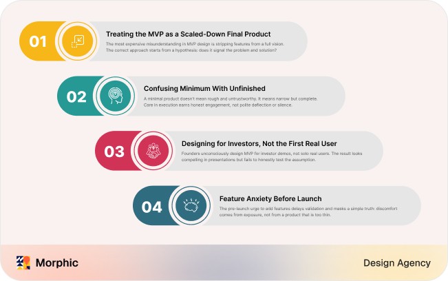
MVP design validation first-steps diagram showing a four-step numbered checklist with toggle indicators

Mistake 2: Confusing Minimum With Unfinished

The pendulum swings both ways. Some founders over-build. Others take minimal as a licence to ship something rough, half-baked, and generally untrustworthy, then wonder why users do not engage honestly. Minimum does not mean unfinished, it means narrow.

A well-designed MVP can and should feel complete within its narrow scope. The few things it does, it should do properly. Users do not need to see every feature you eventually plan to build, but they do need to feel that the thing in front of them was built with care, because that feeling is what earns the honest engagement that produces useful feedback. An MVP that reads as unprofessional does not generate useful research, it generates polite deflection and silent disengagement.

The fix: pick the three things the MVP must do and make them feel finished. Everything else should either not exist in the interface or be clearly marked as coming soon. The line between scope boundary and incompleteness is clarity: users should always know whether something is not-available-yet-by-design versus broken.

Mistake 3: Designing for Investors, Not the First Real User

This one is subtle and extremely common. Founders designing an MVP for an investor demo unconsciously make different decisions than founders designing for a real user to use alone, unsupported, in five minutes on their phone. The investor-demo MVP gets slicker interfaces than necessary at this stage, feature hints baked into the visuals, and screens that look more like a pitch deck mockup than a working tool.

Investor demos have a legitimate place. The problem is when MVP design optimises for how good it looks in a presentation rather than how honestly it tests the business assumption. Quibi burned through roughly $1.75 billion in six months building a product that demoed beautifully and answered a question nobody had asked. It looked compelling in pitch decks. Real users did not use it.

The fix: before finalising any MVP screen, ask whether a real user could accomplish the core task on this screen without you explaining anything. If the answer requires the founder to narrate what is happening, the screen is designed for a demo, not for a user.

SaaS MVP design evaluation matrix showing a grid of design criteria rated across dimensions

Mistake 4: Feature Anxiety Before Launch

There is a particular anxiety that strikes founders in the weeks before an MVP launch. The product feels too thin. Surely it needs one more feature, a notification system, a settings panel, a secondary flow, before it is ready to show people. This instinct is almost always well-intentioned and almost always counterproductive.

Every feature added before launch is a feature that has not been validated by real user behaviour. It is a guess stacked on other guesses. The feeling of being unready rarely reflects an actual functionality gap; it usually reflects the discomfort of putting something small and specific in front of the world. It is one of the most reliable ways to delay learning and inflate scope at exactly the moment when restraint matters most.

The fix: define and freeze the MVP scope in writing before design begins, with a named decision-maker who can approve additions. Make the cost explicit: adding this feature pushes launch back by X weeks and costs Y days of design time. Most scope additions look less attractive when the real cost is visible.

Mistake 5: Polishing the Wrong Things at the Wrong Time

Founders frequently spend disproportionate design effort on the parts of the product that matter least at MVP stage. A beautifully animated onboarding sequence. A settings page with extensive customisation. A dashboard with rich visualisations for a feature most users will not touch for months. Meanwhile the actual core action, the single thing the product needs to prove people will do, gets far less design attention than it deserves.

This happens because polish on secondary features is easier and more satisfying to produce than the harder work of nailing the core experience. It looks like progress. It is usually a distraction from the one design problem that determines whether the MVP teaches you anything useful.

The fix: write a ranked list of the three user actions the MVP must support, ordered by how directly they test the hypothesis. Invest design time in strict proportion to that ranking. The top action gets the majority of attention; the third gets the minimum needed to not actively harm the experience.

Mistake 6: Skipping Validation Before Design Begins

An MVP built without user research is a set of assumptions with a user interface on top. The research failure is not just methodological, it has a direct financial cost: building without testing is expensive and fails most of the time, while the same output from an MVP-first approach costs a fraction and produces validated learning rather than a failed product.

Begin all MVP efforts with validation and research. The validation question is not do users like our idea. It is do users currently have this problem, how do they currently solve it, and what would make them willing to switch? Those three questions, answered by five real interviews with real target users, will change more design decisions than any amount of internal debate.

The fix: run five user interviews with real target users before any design begins. Ask about current behaviour, current workarounds, and current frustrations, not about your product idea. Use those interviews to validate that the problem is real, urgent, and unsatisfactorily solved by existing alternatives.

Mistake 7: Launching Without a Success Metric

Without a defined success metric, an MVP launch produces opinions rather than evidence. Users seemed interested and users were not engaged are both meaningless without a before-measurement and a specific number that defines success. Teams launch, watch the numbers without a target, and end up arguing about whether the data means they should pivot or persist.

The metric should be chosen before design begins, because the choice of metric changes the design. An MVP optimised for trial sign-up volume is designed differently from one optimised for trial-to-paid conversion, which is designed differently again from one optimised for Day 7 retention. Different metrics require different design emphases in the core flow.

The fix: define one metric before design starts and write it down: this MVP succeeds if a specific number of a specific user type complete a specific action within a specific window. That sentence should be visible to the whole team throughout the build.

Mistake 8: Building the Dashboard Before the Core Flow

This is the UX-specific version of the polish-the-wrong-thing mistake, and it is common enough to deserve its own entry. Many SaaS founders, particularly those imagining a data-rich platform, design the dashboard before they have designed and tested the core flow that gets users to the dashboard. The dashboard visualises data that users need to generate by completing actions the flow has not yet taught them.

The activation sequence in most SaaS products runs: account creation, core action, first output, habit formation, then the dashboard as an ongoing reference tool. Designing the dashboard before the core action flow is designing step five before step two exists. Users who cannot complete the core action never reach the dashboard, so the dashboard design, however good, produces no learning from real usage. The design patterns for the dashboard itself, once you get there, are covered in dashboard design for SaaS.

The fix: map the activation sequence for your product before any design begins. Identify the single action that generates first value. Design and test that action until users can complete it unaided. Then, and only then, design the flow that brings them back. The dashboard is the last thing to design, not the first.

Morphic's SaaS onboarding work confirms this in practice. The engagement that took activation from 34% to 61% in 90 days was specifically a redesign of the path to first value, reducing the steps between account creation and the first meaningful output. The dashboard was already well designed. The problem was that users were not reaching it. The full pattern set is in the 10 mobile app onboarding patterns guide.

What Good SaaS MVP Design Actually Looks Like

Good MVP design shares three properties that generalist design advice almost never names.

It is hypothesis-anchored. Every design decision, every flow, label, and CTA, maps back to the one question the MVP is built to answer. The designer can explain why every element exists in terms of the hypothesis being tested.

It is narrow but finished. The scope is intentionally restricted to the core hypothesis, and within that scope the experience is complete: flows do not dead-end, errors are handled, copy is specific. The user never needs to be told to ignore something because it is not ready yet.

It has a clear first-value moment. There is a specific, visible output the user reaches in their first session, not a setup-complete screen but a real result they can evaluate. Morphic's PDP Quality Selector redesign at MissPompadour produced a 10.88% revenue-per-user lift for new visitors in a 28-day A/B test at 94% significance precisely because the redesign made the decision moment clear and the comparison criteria unmistakable. Users could evaluate the value in the moment rather than having to work for it.

The Bottom Line

The most expensive MVP design mistake is not building too many features, it is building the right features in the wrong order and against unvalidated assumptions. An MVP earns its name when it is built around a testable hypothesis, runs five user interviews before design starts, defines one success metric before launch, finishes what is in scope completely, and ensures a real user reaches first value in their first session. Everything else is noise until those five conditions are met.

Building a SaaS MVP and not sure the design is heading in the right direction? Morphic's SaaS design work focuses on exactly this: the core activation flow, designed from hypothesis to first-value moment. Every plan starts with a free 3-day trial before your first invoice, so you see the direction before committing. Book a 30-minute call, see the pricing, or start with the 47-point UX audit checklist to assess your current MVP.

Key Takeaways

Icon

An MVP is not a smaller final product, it is the smallest thing that gives an honest answer about whether the core assumption holds when real people encounter it.

Icon

Minimum means narrow, not unfinished: a rough MVP generates polite deflection rather than the honest engagement that produces useful research.

Icon

Designing for an investor demo produces different decisions than designing for a real user alone on their phone, and only one of those tests the business assumption.

Icon

Run five user interviews and define one success metric before design begins, because both change the design rather than merely describing it afterwards.

Icon

Design the core activation flow before the dashboard, because users who cannot complete the core action never reach the dashboard at all.

Image
Emon Datta

Founder, Morphic Agency

Morphic Agency is a Melbourne-based UX design agency. We've shipped 50+ products across 15+ countries.

Icon
Icon
Icon
Have a Project in Mind? Let's Chat.
Share
Instagram
Facebook
Twitter
Icon

FAQ

Frequently Asked Questions

What is the most common MVP design mistake for SaaS founders?

Treating the MVP as a scaled-down version of the final product, designing by subtracting features from the full vision rather than designing around the hypothesis to test. This produces something that feels incomplete rather than focused, which generates polite user feedback rather than genuine signal. The second most common mistake is launching without a defined success metric, which means the data cannot answer whether to continue, pivot, or stop.

How much design does an MVP actually need?

The core flow, meaning the path from first contact to first value, needs to be designed carefully and completely. Everything else should either not exist in the interface or be visibly marked as coming later. Minimum refers to scope width, not design quality. A narrow, well-designed MVP is more useful than a broad rough one, because it produces cleaner signal: when something does not work you know it is a design or concept problem, not a users-forgave-the-roughness problem.

Should an MVP look polished?

Within its narrow scope, yes. The things the MVP does should be done well. Users do not need to see everything you plan to build eventually, but they do need to feel that what is in front of them was built with care, because that trust earns honest engagement. An MVP that reads as unfinished generates polite deflection rather than genuine use. The rule: finish what is in scope, do not include what is out of scope.

How do I know if my MVP is testing the right hypothesis?

Write the hypothesis in one sentence before any design begins: we believe that a specific user type will take a specific action because of a specific reason. Then ask whether, if users try the MVP and it does not succeed by your defined metric, you will know why. If the answer is no, the hypothesis is too broad. A testable hypothesis produces a specific answer, not just it-worked or it-did-not.

When should a SaaS founder bring in a UX designer for their MVP?

Before any screens are built, ideally before any wireframes exist. The most valuable design input at MVP stage is not visual polish, it is the definition of the core flow, the sequence of user actions from problem to first value, and the design of the activation path. A designer who comes in after the architecture is built can only improve the surface; a designer who comes in at the start can change the fundamental shape of the experience.

Icon

FAQ

Frequently Asked Questions

What is the most common MVP design mistake for SaaS founders?

Treating the MVP as a scaled-down version of the final product, designing by subtracting features from the full vision rather than designing around the hypothesis to test. This produces something that feels incomplete rather than focused, which generates polite user feedback rather than genuine signal. The second most common mistake is launching without a defined success metric, which means the data cannot answer whether to continue, pivot, or stop.

How much design does an MVP actually need?

The core flow, meaning the path from first contact to first value, needs to be designed carefully and completely. Everything else should either not exist in the interface or be visibly marked as coming later. Minimum refers to scope width, not design quality. A narrow, well-designed MVP is more useful than a broad rough one, because it produces cleaner signal: when something does not work you know it is a design or concept problem, not a users-forgave-the-roughness problem.

Should an MVP look polished?

Within its narrow scope, yes. The things the MVP does should be done well. Users do not need to see everything you plan to build eventually, but they do need to feel that what is in front of them was built with care, because that trust earns honest engagement. An MVP that reads as unfinished generates polite deflection rather than genuine use. The rule: finish what is in scope, do not include what is out of scope.

How do I know if my MVP is testing the right hypothesis?

Write the hypothesis in one sentence before any design begins: we believe that a specific user type will take a specific action because of a specific reason. Then ask whether, if users try the MVP and it does not succeed by your defined metric, you will know why. If the answer is no, the hypothesis is too broad. A testable hypothesis produces a specific answer, not just it-worked or it-did-not.

When should a SaaS founder bring in a UX designer for their MVP?

Before any screens are built, ideally before any wireframes exist. The most valuable design input at MVP stage is not visual polish, it is the definition of the core flow, the sequence of user actions from problem to first value, and the design of the activation path. A designer who comes in after the architecture is built can only improve the surface; a designer who comes in at the start can change the fundamental shape of the experience.

Icon

FAQ

Frequently Asked Questions

What is the most common MVP design mistake for SaaS founders?

Treating the MVP as a scaled-down version of the final product, designing by subtracting features from the full vision rather than designing around the hypothesis to test. This produces something that feels incomplete rather than focused, which generates polite user feedback rather than genuine signal. The second most common mistake is launching without a defined success metric, which means the data cannot answer whether to continue, pivot, or stop.

How much design does an MVP actually need?

The core flow, meaning the path from first contact to first value, needs to be designed carefully and completely. Everything else should either not exist in the interface or be visibly marked as coming later. Minimum refers to scope width, not design quality. A narrow, well-designed MVP is more useful than a broad rough one, because it produces cleaner signal: when something does not work you know it is a design or concept problem, not a users-forgave-the-roughness problem.

Should an MVP look polished?

Within its narrow scope, yes. The things the MVP does should be done well. Users do not need to see everything you plan to build eventually, but they do need to feel that what is in front of them was built with care, because that trust earns honest engagement. An MVP that reads as unfinished generates polite deflection rather than genuine use. The rule: finish what is in scope, do not include what is out of scope.

How do I know if my MVP is testing the right hypothesis?

Write the hypothesis in one sentence before any design begins: we believe that a specific user type will take a specific action because of a specific reason. Then ask whether, if users try the MVP and it does not succeed by your defined metric, you will know why. If the answer is no, the hypothesis is too broad. A testable hypothesis produces a specific answer, not just it-worked or it-did-not.

When should a SaaS founder bring in a UX designer for their MVP?

Before any screens are built, ideally before any wireframes exist. The most valuable design input at MVP stage is not visual polish, it is the definition of the core flow, the sequence of user actions from problem to first value, and the design of the activation path. A designer who comes in after the architecture is built can only improve the surface; a designer who comes in at the start can change the fundamental shape of the experience.

Icon

TESTIMONIALS

Real feedback from founders and product teams we have worked with.

  • I have had the pleasure of working with Morphic for over a year and he has consistently been very creative, kind and attentive person to work with! He is very attentive, intuitive and is truly talented! He is absolutely wonderful!

    Author Image
    Ashley Sabatini

    Founder, Breathwork

  • I have had the pleasure of working with Morphic for over a year and he has consistently been very creative, kind and attentive person to work with! He is very attentive, intuitive and is truly talented! He is absolutely wonderful!

    Tobias F

    Founder & CEO, MingleMinds

  • Working with Emon was amazing. I initially gave him a take home design assignment with clear goals and he was able to understand my vision with no problem. That delivery was on time and we have collaborated on everything from wireframes to the complete UX/UI of my project. I will continue working with him at every chance possible. You should too!

    Author Image
    Tobias F

    Founder, MingleMinds

  • Working with Emon was a great experience. Super clear communication, easy to work with, and he pushed us in the right direction. The designs were creative, practical. The project is now one of our most successful features. 100% recommend.

    Author Image
    Callum Johnstone

    Product Owner, Nursery Story

  • Morphic was fantastic to work with - putting in a lot of effort to make sure he understood the assignment and requirements. He came up with some great designs, absolutely nailing the brief. Look forward to working with him again. Thanks Emon!

    Author Image
    Sam

    Founder, Amigos

  • Top-tier Website designer. Great communication, fast delivery, and excellent usability improvements.

    Author Image
    Eric

    CoFounder, GKM Interactive

  • Emon is a talented and reliable designer with a great eye for detail. He quickly understood the project goals and delivered clean, modern designs that matched our vision. Communication was smooth and professional throughout the process, and he was always open to feedback and ready to adjust things when needed. Highly recommended for anyone looking for high-quality UX/UI work.

    Author Image
    Kaja Rutkowska

    CoFounder, Petifit

  • Emon is an amazing human and wonderful person to work with. His attention to detail and sole focus on each individual project he undertakes makes getting the job done feel like a breeze. I’ve personally worked with Emon on near 50+ projects all of which Emon has shown immense care and dedication to all work. Communication was a 10/10, he always put in overtime in making sure the work and overall goal was clearly stated and achieved. As a person he has an amazing heart and always there to support and help no matter what. He is a good man and a really strong employee that can be counted on!

    Author Image
    Jude Lopez

    Founder, HomeIO

Icon

TESTIMONIALS

Real feedback from founders and product teams we have worked with.

  • I have had the pleasure of working with Morphic for over a year and he has consistently been very creative, kind and attentive person to work with! He is very attentive, intuitive and is truly talented! He is absolutely wonderful!

    Author Image
    Ashley Sabatini

    Founder, Breathwork

  • I have had the pleasure of working with Morphic for over a year and he has consistently been very creative, kind and attentive person to work with! He is very attentive, intuitive and is truly talented! He is absolutely wonderful!

    Tobias F

    Founder & CEO, MingleMinds

  • Working with Emon was amazing. I initially gave him a take home design assignment with clear goals and he was able to understand my vision with no problem. That delivery was on time and we have collaborated on everything from wireframes to the complete UX/UI of my project. I will continue working with him at every chance possible. You should too!

    Author Image
    Tobias F

    Founder, MingleMinds

  • Working with Emon was a great experience. Super clear communication, easy to work with, and he pushed us in the right direction. The designs were creative, practical. The project is now one of our most successful features. 100% recommend.

    Author Image
    Callum Johnstone

    Product Owner, Nursery Story

  • Morphic was fantastic to work with - putting in a lot of effort to make sure he understood the assignment and requirements. He came up with some great designs, absolutely nailing the brief. Look forward to working with him again. Thanks Emon!

    Author Image
    Sam

    Founder, Amigos

  • Top-tier Website designer. Great communication, fast delivery, and excellent usability improvements.

    Author Image
    Eric

    CoFounder, GKM Interactive

  • Emon is a talented and reliable designer with a great eye for detail. He quickly understood the project goals and delivered clean, modern designs that matched our vision. Communication was smooth and professional throughout the process, and he was always open to feedback and ready to adjust things when needed. Highly recommended for anyone looking for high-quality UX/UI work.

    Author Image
    Kaja Rutkowska

    CoFounder, Petifit

  • Emon is an amazing human and wonderful person to work with. His attention to detail and sole focus on each individual project he undertakes makes getting the job done feel like a breeze. I’ve personally worked with Emon on near 50+ projects all of which Emon has shown immense care and dedication to all work. Communication was a 10/10, he always put in overtime in making sure the work and overall goal was clearly stated and achieved. As a person he has an amazing heart and always there to support and help no matter what. He is a good man and a really strong employee that can be counted on!

    Author Image
    Jude Lopez

    Founder, HomeIO

Icon

TESTIMONIALS

Real feedback from founders and product teams we have worked with.

  • I have had the pleasure of working with Morphic for over a year and he has consistently been very creative, kind and attentive person to work with! He is very attentive, intuitive and is truly talented! He is absolutely wonderful!

    Author Image
    Ashley Sabatini

    Founder, Breathwork

  • I have had the pleasure of working with Morphic for over a year and he has consistently been very creative, kind and attentive person to work with! He is very attentive, intuitive and is truly talented! He is absolutely wonderful!

    Tobias F

    Founder & CEO, MingleMinds

  • Working with Emon was amazing. I initially gave him a take home design assignment with clear goals and he was able to understand my vision with no problem. That delivery was on time and we have collaborated on everything from wireframes to the complete UX/UI of my project. I will continue working with him at every chance possible. You should too!

    Author Image
    Tobias F

    Founder, MingleMinds

  • Working with Emon was a great experience. Super clear communication, easy to work with, and he pushed us in the right direction. The designs were creative, practical. The project is now one of our most successful features. 100% recommend.

    Author Image
    Callum Johnstone

    Product Owner, Nursery Story

  • Morphic was fantastic to work with - putting in a lot of effort to make sure he understood the assignment and requirements. He came up with some great designs, absolutely nailing the brief. Look forward to working with him again. Thanks Emon!

    Author Image
    Sam

    Founder, Amigos

  • Top-tier Website designer. Great communication, fast delivery, and excellent usability improvements.

    Author Image
    Eric

    CoFounder, GKM Interactive

  • Emon is a talented and reliable designer with a great eye for detail. He quickly understood the project goals and delivered clean, modern designs that matched our vision. Communication was smooth and professional throughout the process, and he was always open to feedback and ready to adjust things when needed. Highly recommended for anyone looking for high-quality UX/UI work.

    Author Image
    Kaja Rutkowska

    CoFounder, Petifit

  • Emon is an amazing human and wonderful person to work with. His attention to detail and sole focus on each individual project he undertakes makes getting the job done feel like a breeze. I’ve personally worked with Emon on near 50+ projects all of which Emon has shown immense care and dedication to all work. Communication was a 10/10, he always put in overtime in making sure the work and overall goal was clearly stated and achieved. As a person he has an amazing heart and always there to support and help no matter what. He is a good man and a really strong employee that can be counted on!

    Author Image
    Jude Lopez

    Founder, HomeIO