B2B SaaS Website Design: 14 Patterns That Convert

Published:

Reading time:

12 min read
Category:
Strategy
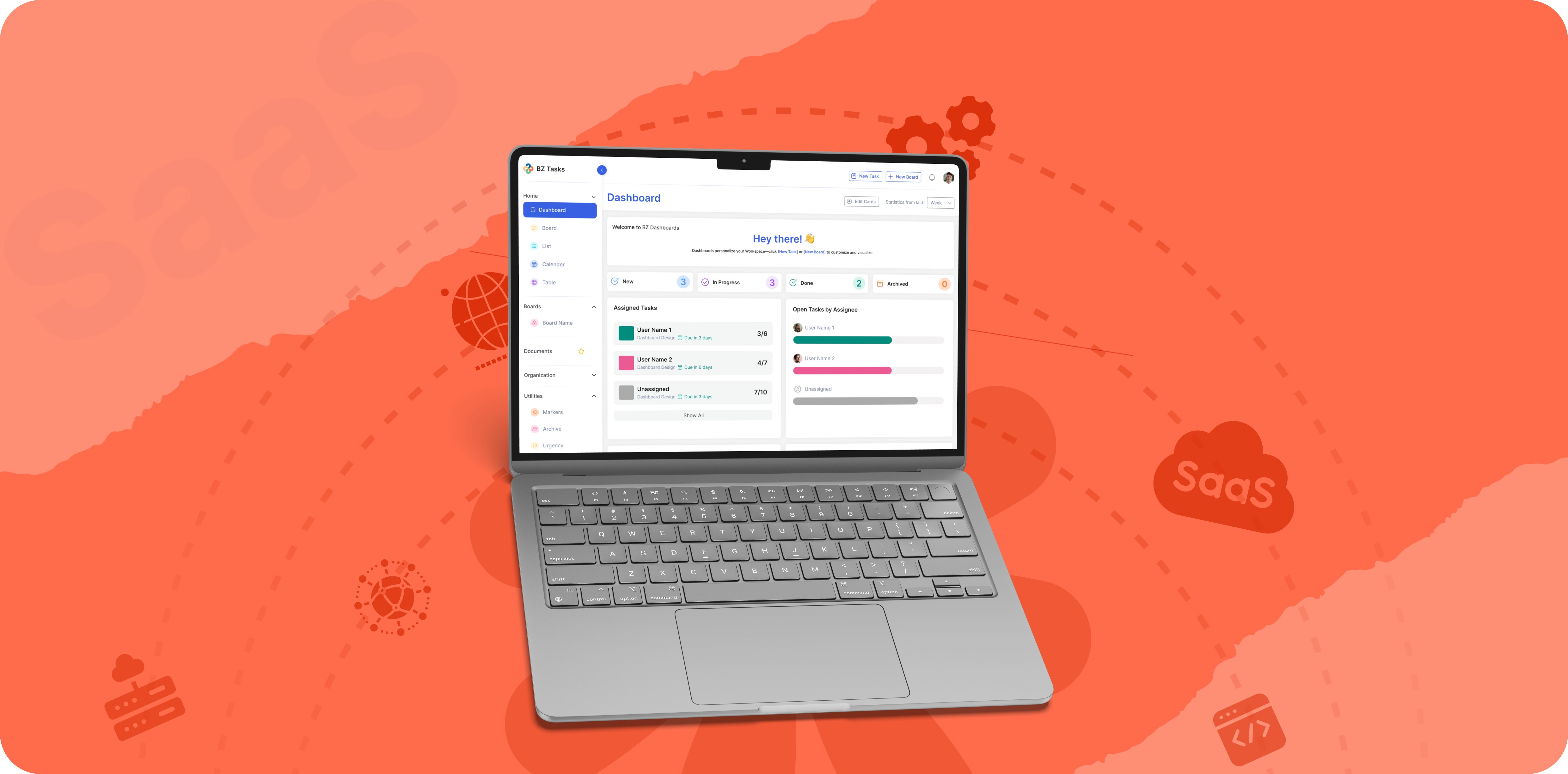
Illustrated laptop showing a SaaS dashboard against a coral-red background with floating UI graphics

Your B2B SaaS website design has one job, and it is not looking credible. It is moving a specific visitor, a founder, an operator, a team lead with a problem and a browser full of your competitors, one step closer to trying or buying. Every pattern below is in service of that single job.

The baseline context: average B2B SaaS website conversion rates sit between 1 and 3 percent, with most of the gap between average and top-quartile performers explained by a handful of structural choices rather than visual polish. These 14 patterns come from designing and auditing SaaS marketing sites across 50+ shipped products, alongside the conversion research that keeps confirming the same human behaviours. For each: the pattern, why it works, and the common way teams get it almost-right-but-wrong.

The 14 patterns fall into four zones: above the fold (comprehension, CTA, product proof, credibility), the middle section (features as problems, how it works, proof placement, objection handling, comparison), pricing and commitment (pricing clarity, tier architecture, risk reversal), and connective tissue (site-as-funnel, mobile design). Fix in funnel order: hero comprehension first, then proof placement, then pricing.

Above the Fold: The Five-Second Layer

Nielsen Norman Group research establishes that users typically leave web pages within 10 to 20 seconds without a compelling reason to stay. Most of that decision is made at or near the top of the page, and clarity beats cleverness: the hero is not a billboard for brand personality, it is a promise to a specific person that this is the right place for their problem.

1. The hero states the outcome, in the customer's words. The five-second test, showing a page to an unfamiliar viewer then asking what the company does, reliably exposes the gap between what a team thinks its headline communicates and what a stranger receives. A headline a stranger in your ICP can understand in five seconds, describing the result of using the product, not the category ("AI-powered workflow platform") and not cleverness. The subhead carries the mechanism; the headline carries the outcome. The almost-right version is outcome language so abstract it fits any product ("Work smarter, together"). Test: cover your logo. Could a competitor run your headline? Then it is not yours.

2. One primary action, honestly labelled. Unbounce's analysis of 18,639 landing pages found single-CTA pages convert at 13.5 percent on average, compared to 10.5 percent for pages with five or more CTAs. Every additional CTA forces the visitor to choose which action to take before deciding whether to take any action. Use a single dominant CTA stating what happens next ("Start free trial," "Book a demo," "See pricing") and demote the secondary path to a link, not a second button.

3. Show the product immediately. B2B buyers have been burned by vapourware long enough that abstract illustrations now register as evasion. Show a real screenshot, a short product clip, or an interactive frame within the first viewport. If your product is too rough to show, that is a finding, but the solution is almost always a targeted flow fix, not a polished stock photo of a smiling person. The almost-right version is a 3D render of a floating interface that shows nothing about how the product actually works.

4. The credibility strip earns the scroll. Logos, user counts, or a single sharp metric directly under the hero tell the visitor that someone in a comparable situation already made this bet. Five recognisable-to-your-ICP names beat twenty enterprise trophies at a startup-focused product. If your ICP is a Series A founder and your logo strip features Fortune 500 companies, you have introduced doubt rather than removed it.

The Middle: Where Comprehension Converts

The middle of a B2B SaaS page handles the consideration layer: the visitor has decided to keep reading but has not decided to act. The persuasion work happens through evidence placed in the right sequence. The most common mistake is featuring correct information in the wrong order, which produces accurate pages that do not convert.

5. Features framed as problems being removed. Buyers do not shop features; they shop relief. Each feature block leads with the pain it removes, then the capability, then the proof. The almost-right version is a block titled "Advanced Workflow Automation" when the buyer's lived experience is "my team manually updates Notion every Friday and half the time it is wrong."

6. The how it works section actually says how it works. The biggest unspoken objection in B2B software purchases is how much work this will be for my team. Three to four concrete steps from signup to value, with real screenshots per step, handle the implementation anxiety before the visitor has to ask. The almost-right version is four icon-only steps labelled Connect, Configure, Automate, Scale, which describes every SaaS product ever built.

7. Proof with numbers, placed at the claim. A quote about easy migration belongs beside the migration section, not pooled in a carousel at the bottom. Specificity converts in ways adjectives cannot. Morphic's own site leads with case study outcomes rather than adjectives ("activation went from 34% to 61% in 90 days") because that is a result a founder with an activation problem can project onto. The almost-right version is a wall of five-star testimonials with no numbers, detached from any specific product claim.

8. The objection ledger. B2B purchases are rarely one-person decisions: IT vetoes on security, the team lead on implementation burden, finance on contract flexibility. Address the top three reasons your real prospects do not buy, mined from lost-deal notes and sales calls, not the polite ones. The almost-right version is an FAQ of softball questions nobody asked.

9. Comparison content you control. Evaluation-stage buyers search your-product vs alternative whether you participate or not. A fair, factual comparison section keeps that evaluation on your site, in criteria you chose. Honesty is load-bearing: conceding a real weakness buys belief for every claimed strength. The almost-right version wins every column with five stars, which evaluators discount on sight.

B2B SaaS website middle-page pattern diagram showing a dark ‘Why Teams Choose Season AI’ product page

Pricing & Commitment: Where Money Decides

Pricing pages are where the consideration layer ends and the decision layer begins. They are also where most B2B SaaS sites introduce avoidable friction: by hiding pricing, overwhelming with tier options, or leaving commitment risk unaddressed at exactly the pixel where doubt lives.

10. Pricing is findable and answers the four buyer questions. Transparent pricing pages outperform contact-us-for-pricing pages for product-led growth, because self-serve buyers research without talking to sales and penalise friction. The four questions a pricing page must answer: what does it cost, what do I get at each tier, what happens at the limits, and how do I leave. Hidden pricing on a product aimed at startup buyers is a conversion tax. The almost-right version answers the first three questions but not the fourth (how do I leave), which is where handled objections instead go to a sales call.

11. The recommended tier does the choosing. A highlighted anchor option reduces decision paralysis relative to an unguided three-option layout. One visually promoted plan with a most-popular anchor, tiers named by customer type rather than metal (Starter, Team, Scale beats Silver, Gold, Platinum), and the billing toggle defaulting to the option you want chosen. The default is not manipulation, it is guidance, and the alternative is abandonment.

12. Risk reversal at the point of commitment. Commitment anxiety (what if this does not work?) is one of the primary causes of drop-off at the payment step. A guarantee, free tier, cancel-anytime clarity, or trial terms, stated beside the CTA at the exact pixel where hesitation happens, not on a policy page. Morphic's version is a free 3-day trial before your first invoice, and it sits next to every start button, because that is where the doubt lives. The almost-right version buries trial and cancellation terms in the footer, where a hesitant visitor has already left before finding them.

B2B SaaS website pricing page pattern diagram showing a dark feature comparison layout

The Connective Tissue

13. The site is a funnel, not a brochure. Most B2B SaaS sites are built page by page, each a standalone destination, so they individually make sense but collectively have no flow. Blog posts end without routing anywhere; case studies do not tell the visitor what to do next; the about page talks about the team and stops. Every page should end with the logical next step: blog posts route to the relevant service, case studies route to see-if-this-applies-to-you, the about page routes to proof. The almost-right version is a related-posts widget that loops visitors through content with no path toward any action: high time-on-site, zero conversion momentum.

14. Mobile is designed, not survived. Over 40 percent of first B2B visits arrive on mobile, even for decisions that ultimately happen on desktop: founders shortlist on their phones, then buy on a laptop the next day. Lose the first visit and the second never happens. Walk your own mobile flow: thumb-reachable CTA, a pricing table that does not need pinching, forms that respect autocomplete, hero copy that does not truncate below the first sentence. The almost-right version renders responsively while doubling every friction, technically responsive and practically unusable.

How to Apply This Without Redesigning Everything

Resist the rebuild reflex. Most site fixes are pattern-level, not site-level, and the correct order matters more than speed.

Step 1, score your current site against the 14 patterns. Pass or fail, roughly an hour. The patterns are binary enough that honest self-scoring produces a usable list, though the almost-right detection is harder without stranger’s eyes.

Step 2, fix in funnel order. Hero comprehension (patterns 1 to 3) first, because everything downstream inherits its losses: a visitor who does not understand the value proposition in five seconds does not evaluate features, pricing, or objection handling. Then proof placement (7 to 8). Then pricing clarity (10 to 12).

Step 3, measure between patterns. Site changes are unusually cheap to A/B test. Let each fix bank its result before the next ships. The data tells you which pattern was the real bottleneck and which would have changed nothing.

Most audited sites get their largest single conversion gain from patterns 1, 10, or 12 alone, which means most “we need a new website” briefs are actually three-pattern fixes wearing a redesign costume. A redesign built on undiagnosed patterns just rebuilds the same problems with better typography.

Pattern Group

Fix priority if failing

Patterns 1–4 (Above the fold)

Fix first: highest impact on all downstream metrics

Patterns 5–6 (Features, how it works)

Fix second: handles the consideration layer

Patterns 7–9 (Proof, objections, comparison)

Fix third: closes the evaluation gap

Patterns 10–12 (Pricing, tiers, risk reversal)

Fix fourth: converts evaluated visitors

Patterns 13–14 (Funnel flow, mobile)

Fix in parallel: structural, affects all pages

B2B SaaS website connectivity diagram showing a man presenting before a ‘Design Webflow’ dark interface

The Bottom Line

B2B SaaS website design that converts is not a style; it is fourteen specific jobs done in order: instant comprehension, visible product, relevant proof, honest objection handling, findable pricing, risk reversal at the button, and a funnel with no dead ends. Score your site against the patterns, fix in funnel order, and measure between fixes.

Want your three biggest pattern failures identified this week? Morphic scores sites against these patterns as part of its SaaS design work, delivered as an effort-scored fix list, and every engagement starts with a free 3-day trial. Book a call to identify your top three patterns live.

Title 07 - Title 15 and Main Content 07 - Main Content 15

Leave empty (this post uses 6 sections).

Key Takeaways

Icon

A B2B SaaS website has one job: moving a specific visitor one step closer to trying or buying, and average conversion sits at just 1 to 3 percent.

Icon

The 14 patterns span four zones: above the fold, the consideration middle, pricing and commitment, and the connective tissue of funnel flow and mobile.

Icon

Single-CTA landing pages convert at 13.5 percent versus 10.5 percent for pages with five or more CTAs, so one honest primary action beats splitting intent.

Icon

Transparent pricing that answers what it costs, what you get, what happens at the limits, and how to leave outperforms contact-us-for-pricing for product-led SaaS.

Icon

Fix in funnel order (hero first, then proof, then pricing) and measure between changes; most new-website briefs are three-pattern fixes wearing a redesign costume.

Image
Emon Datta

Founder, Morphic Agency

Morphic Agency is a Melbourne-based UX design agency. We've shipped 50+ products across 15+ countries.

Icon
Icon
Icon
Have a Project in Mind? Let's Chat.
Share
Instagram
Facebook
Twitter
Icon

FAQ

Frequently Asked Questions

What is the most common B2B SaaS website mistake?

Heroes that describe the category instead of the outcome. The five-second comprehension failure poisons every metric downstream: visitors who do not understand what the product does in five seconds do not evaluate features, pricing, or proof. It is usually fixable in a day of copy revision.

Should B2B SaaS sites show pricing?

For product-led, startup-targeted SaaS, yes. Buyers self-serve their research and penalise vendors who introduce friction into that process. Pure enterprise sales motions where pricing is genuinely customised per contract are the legitimate exception; pre-seed to Series B SaaS is almost never that exception, even when founders tell themselves it is.

How long should a SaaS homepage be?

As long as the objections require, and no longer. High-consideration products legitimately need the consideration-layer patterns to handle evaluation. The sin is not length, it is sections that exist for the company (Our Values, Our Team) instead of the buyer's decision. Cut anything a prospect would not read while deciding.

Webflow, Framer, or custom for a SaaS website?

For pre-Series-B, a modern site builder almost always. Iteration speed beats marginal pixel control, and all 14 patterns are platform-independent. The tool is rarely the bottleneck; the messaging and structure are. Morphic builds conversion-focused Framer sites, and the argument for a custom build rarely holds up for early-stage SaaS.

Can you audit our site against these patterns?

Yes. Scoring a site against the 14 patterns is a standard component of a UX audit, delivered as an effort-scored fix list. You can also start with the free 47-point checklist and score yourself first.

Icon

FAQ

Frequently Asked Questions

What is the most common B2B SaaS website mistake?

Heroes that describe the category instead of the outcome. The five-second comprehension failure poisons every metric downstream: visitors who do not understand what the product does in five seconds do not evaluate features, pricing, or proof. It is usually fixable in a day of copy revision.

Should B2B SaaS sites show pricing?

For product-led, startup-targeted SaaS, yes. Buyers self-serve their research and penalise vendors who introduce friction into that process. Pure enterprise sales motions where pricing is genuinely customised per contract are the legitimate exception; pre-seed to Series B SaaS is almost never that exception, even when founders tell themselves it is.

How long should a SaaS homepage be?

As long as the objections require, and no longer. High-consideration products legitimately need the consideration-layer patterns to handle evaluation. The sin is not length, it is sections that exist for the company (Our Values, Our Team) instead of the buyer's decision. Cut anything a prospect would not read while deciding.

Webflow, Framer, or custom for a SaaS website?

For pre-Series-B, a modern site builder almost always. Iteration speed beats marginal pixel control, and all 14 patterns are platform-independent. The tool is rarely the bottleneck; the messaging and structure are. Morphic builds conversion-focused Framer sites, and the argument for a custom build rarely holds up for early-stage SaaS.

Can you audit our site against these patterns?

Yes. Scoring a site against the 14 patterns is a standard component of a UX audit, delivered as an effort-scored fix list. You can also start with the free 47-point checklist and score yourself first.

Icon

FAQ

Frequently Asked Questions

What is the most common B2B SaaS website mistake?

Heroes that describe the category instead of the outcome. The five-second comprehension failure poisons every metric downstream: visitors who do not understand what the product does in five seconds do not evaluate features, pricing, or proof. It is usually fixable in a day of copy revision.

Should B2B SaaS sites show pricing?

For product-led, startup-targeted SaaS, yes. Buyers self-serve their research and penalise vendors who introduce friction into that process. Pure enterprise sales motions where pricing is genuinely customised per contract are the legitimate exception; pre-seed to Series B SaaS is almost never that exception, even when founders tell themselves it is.

How long should a SaaS homepage be?

As long as the objections require, and no longer. High-consideration products legitimately need the consideration-layer patterns to handle evaluation. The sin is not length, it is sections that exist for the company (Our Values, Our Team) instead of the buyer's decision. Cut anything a prospect would not read while deciding.

Webflow, Framer, or custom for a SaaS website?

For pre-Series-B, a modern site builder almost always. Iteration speed beats marginal pixel control, and all 14 patterns are platform-independent. The tool is rarely the bottleneck; the messaging and structure are. Morphic builds conversion-focused Framer sites, and the argument for a custom build rarely holds up for early-stage SaaS.

Can you audit our site against these patterns?

Yes. Scoring a site against the 14 patterns is a standard component of a UX audit, delivered as an effort-scored fix list. You can also start with the free 47-point checklist and score yourself first.

Icon

TESTIMONIALS

Real feedback from founders and product teams we have worked with.

  • I have had the pleasure of working with Morphic for over a year and he has consistently been very creative, kind and attentive person to work with! He is very attentive, intuitive and is truly talented! He is absolutely wonderful!

    Author Image
    Ashley Sabatini

    Founder, Breathwork

  • I have had the pleasure of working with Morphic for over a year and he has consistently been very creative, kind and attentive person to work with! He is very attentive, intuitive and is truly talented! He is absolutely wonderful!

    Tobias F

    Founder & CEO, MingleMinds

  • Working with Emon was amazing. I initially gave him a take home design assignment with clear goals and he was able to understand my vision with no problem. That delivery was on time and we have collaborated on everything from wireframes to the complete UX/UI of my project. I will continue working with him at every chance possible. You should too!

    Author Image
    Tobias F

    Founder, MingleMinds

  • Working with Emon was a great experience. Super clear communication, easy to work with, and he pushed us in the right direction. The designs were creative, practical. The project is now one of our most successful features. 100% recommend.

    Author Image
    Callum Johnstone

    Product Owner, Nursery Story

  • Morphic was fantastic to work with - putting in a lot of effort to make sure he understood the assignment and requirements. He came up with some great designs, absolutely nailing the brief. Look forward to working with him again. Thanks Emon!

    Author Image
    Sam

    Founder, Amigos

  • Top-tier Website designer. Great communication, fast delivery, and excellent usability improvements.

    Author Image
    Eric

    CoFounder, GKM Interactive

  • Emon is a talented and reliable designer with a great eye for detail. He quickly understood the project goals and delivered clean, modern designs that matched our vision. Communication was smooth and professional throughout the process, and he was always open to feedback and ready to adjust things when needed. Highly recommended for anyone looking for high-quality UX/UI work.

    Author Image
    Kaja Rutkowska

    CoFounder, Petifit

  • Emon is an amazing human and wonderful person to work with. His attention to detail and sole focus on each individual project he undertakes makes getting the job done feel like a breeze. I’ve personally worked with Emon on near 50+ projects all of which Emon has shown immense care and dedication to all work. Communication was a 10/10, he always put in overtime in making sure the work and overall goal was clearly stated and achieved. As a person he has an amazing heart and always there to support and help no matter what. He is a good man and a really strong employee that can be counted on!

    Author Image
    Jude Lopez

    Founder, HomeIO

Icon

TESTIMONIALS

Real feedback from founders and product teams we have worked with.

  • I have had the pleasure of working with Morphic for over a year and he has consistently been very creative, kind and attentive person to work with! He is very attentive, intuitive and is truly talented! He is absolutely wonderful!

    Author Image
    Ashley Sabatini

    Founder, Breathwork

  • I have had the pleasure of working with Morphic for over a year and he has consistently been very creative, kind and attentive person to work with! He is very attentive, intuitive and is truly talented! He is absolutely wonderful!

    Tobias F

    Founder & CEO, MingleMinds

  • Working with Emon was amazing. I initially gave him a take home design assignment with clear goals and he was able to understand my vision with no problem. That delivery was on time and we have collaborated on everything from wireframes to the complete UX/UI of my project. I will continue working with him at every chance possible. You should too!

    Author Image
    Tobias F

    Founder, MingleMinds

  • Working with Emon was a great experience. Super clear communication, easy to work with, and he pushed us in the right direction. The designs were creative, practical. The project is now one of our most successful features. 100% recommend.

    Author Image
    Callum Johnstone

    Product Owner, Nursery Story

  • Morphic was fantastic to work with - putting in a lot of effort to make sure he understood the assignment and requirements. He came up with some great designs, absolutely nailing the brief. Look forward to working with him again. Thanks Emon!

    Author Image
    Sam

    Founder, Amigos

  • Top-tier Website designer. Great communication, fast delivery, and excellent usability improvements.

    Author Image
    Eric

    CoFounder, GKM Interactive

  • Emon is a talented and reliable designer with a great eye for detail. He quickly understood the project goals and delivered clean, modern designs that matched our vision. Communication was smooth and professional throughout the process, and he was always open to feedback and ready to adjust things when needed. Highly recommended for anyone looking for high-quality UX/UI work.

    Author Image
    Kaja Rutkowska

    CoFounder, Petifit

  • Emon is an amazing human and wonderful person to work with. His attention to detail and sole focus on each individual project he undertakes makes getting the job done feel like a breeze. I’ve personally worked with Emon on near 50+ projects all of which Emon has shown immense care and dedication to all work. Communication was a 10/10, he always put in overtime in making sure the work and overall goal was clearly stated and achieved. As a person he has an amazing heart and always there to support and help no matter what. He is a good man and a really strong employee that can be counted on!

    Author Image
    Jude Lopez

    Founder, HomeIO

Icon

TESTIMONIALS

Real feedback from founders and product teams we have worked with.

  • I have had the pleasure of working with Morphic for over a year and he has consistently been very creative, kind and attentive person to work with! He is very attentive, intuitive and is truly talented! He is absolutely wonderful!

    Author Image
    Ashley Sabatini

    Founder, Breathwork

  • I have had the pleasure of working with Morphic for over a year and he has consistently been very creative, kind and attentive person to work with! He is very attentive, intuitive and is truly talented! He is absolutely wonderful!

    Tobias F

    Founder & CEO, MingleMinds

  • Working with Emon was amazing. I initially gave him a take home design assignment with clear goals and he was able to understand my vision with no problem. That delivery was on time and we have collaborated on everything from wireframes to the complete UX/UI of my project. I will continue working with him at every chance possible. You should too!

    Author Image
    Tobias F

    Founder, MingleMinds

  • Working with Emon was a great experience. Super clear communication, easy to work with, and he pushed us in the right direction. The designs were creative, practical. The project is now one of our most successful features. 100% recommend.

    Author Image
    Callum Johnstone

    Product Owner, Nursery Story

  • Morphic was fantastic to work with - putting in a lot of effort to make sure he understood the assignment and requirements. He came up with some great designs, absolutely nailing the brief. Look forward to working with him again. Thanks Emon!

    Author Image
    Sam

    Founder, Amigos

  • Top-tier Website designer. Great communication, fast delivery, and excellent usability improvements.

    Author Image
    Eric

    CoFounder, GKM Interactive

  • Emon is a talented and reliable designer with a great eye for detail. He quickly understood the project goals and delivered clean, modern designs that matched our vision. Communication was smooth and professional throughout the process, and he was always open to feedback and ready to adjust things when needed. Highly recommended for anyone looking for high-quality UX/UI work.

    Author Image
    Kaja Rutkowska

    CoFounder, Petifit

  • Emon is an amazing human and wonderful person to work with. His attention to detail and sole focus on each individual project he undertakes makes getting the job done feel like a breeze. I’ve personally worked with Emon on near 50+ projects all of which Emon has shown immense care and dedication to all work. Communication was a 10/10, he always put in overtime in making sure the work and overall goal was clearly stated and achieved. As a person he has an amazing heart and always there to support and help no matter what. He is a good man and a really strong employee that can be counted on!

    Author Image
    Jude Lopez

    Founder, HomeIO